Branding/Logo Design
Designing a dynamic and bold brand identity for Tasean Eco Travel
The Challenge
Tasean Eco Travel Limited needed a distinctive brand identity that captured their mission of promoting sustainable, memorable travel experiences. The goal was to build an approachable visual system embodying nature, movement, and exploration, while balancing an adventurous spirit with a professional feel.
The Strategy
Instead of standard, corporate eco-clichés, we leaned into the raw emotion of travel—the warmth of a sunset, the texture of the earth, and the literal path of a journey. The strategy focused on making the brand feel highly personal, inviting, and grounded in real-world exploration.
The Solution
1. The Logo Mark
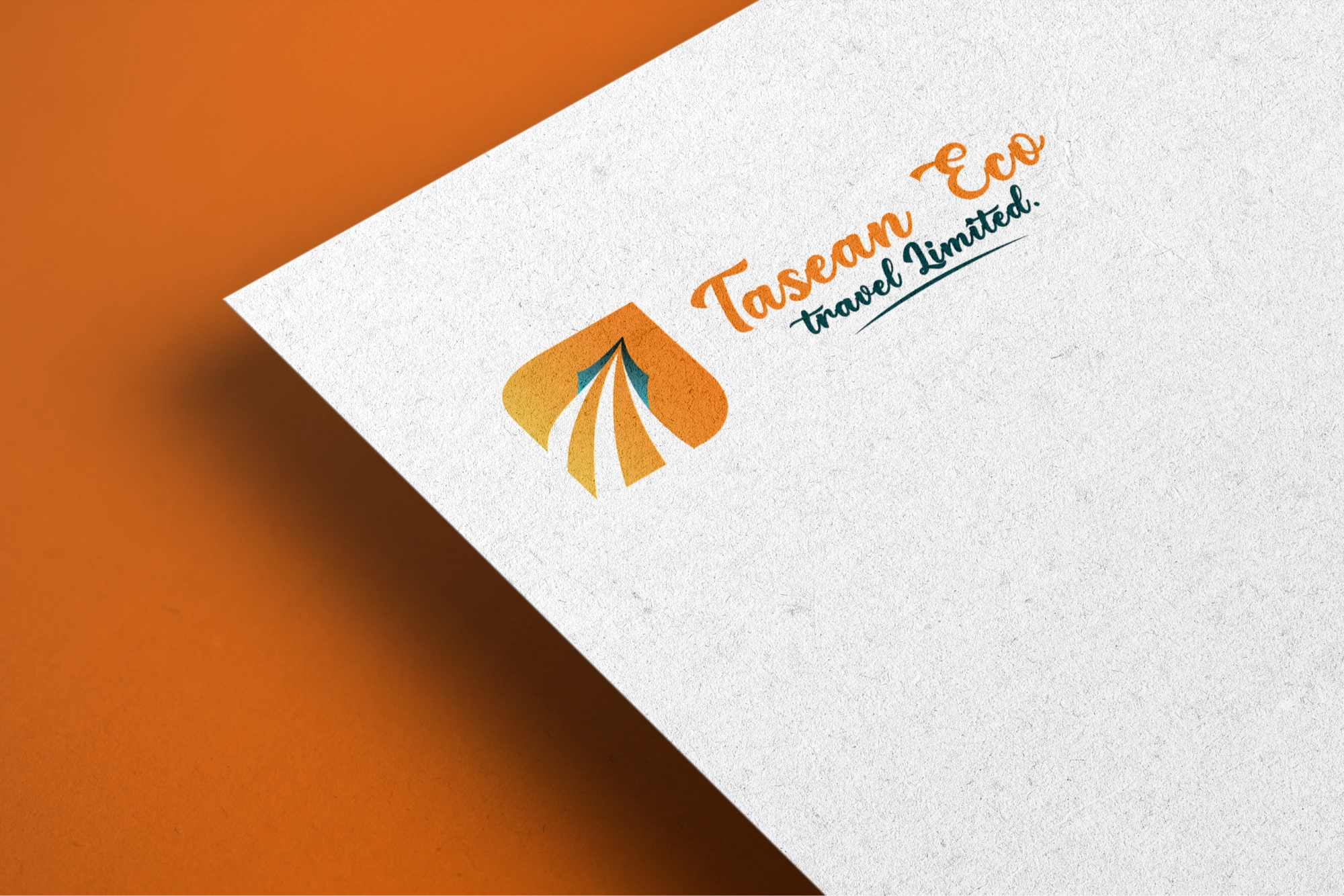
The icon features a stylized pathway or road converging toward a peak, nestled within an organic, rounded frame. The perspective draws the eye forward, perfectly symbolizing the journey, movement, and the literal open road of eco-exploration.
2. Typography & Texture
Typography: Moving away from rigid corporate fonts, the wordmark uses a friendly, organic script for “Tasean Eco” and a flowing handwritten typeface for “travel limited.” This choice gives the brand a human, approachable, and adventurous touch – reminiscent of a personal travel journal.
Texture: The visual ecosystem relies on rich, organic textures to reinforce the tactile, down-to-earth nature of eco-tourism.
3. The Color Palette
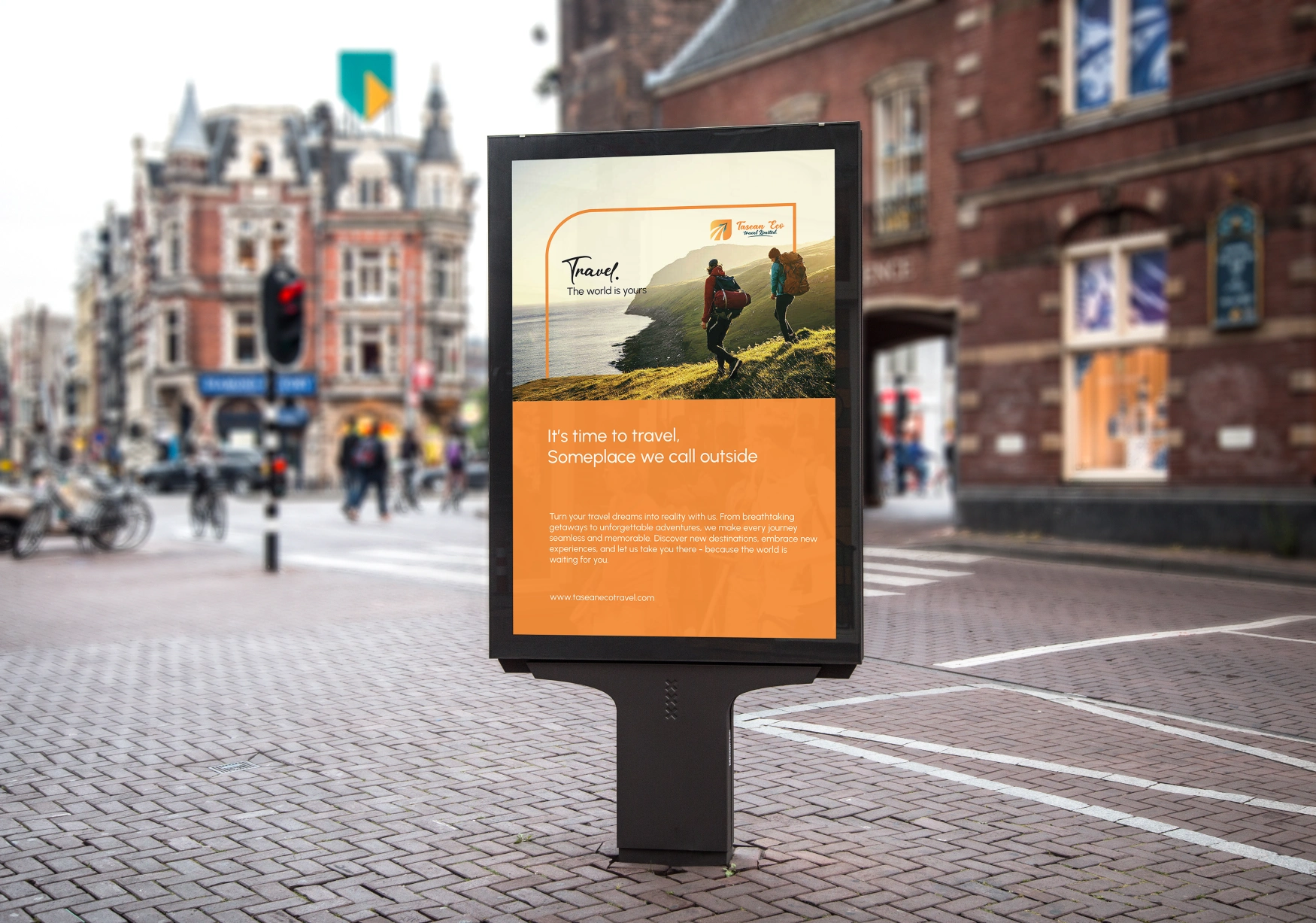
Vibrant Sunset Orange: Dominates the primary mark and lettering, evoking warmth, energy, enthusiasm, and the spirit of discovery.
Deep Forest Teal: Grounding the orange, this deep teal/green shade represents nature, sustainability, and the professional security travelers look for.
The Outcome
The final identity brings an authentic, human-centric energy to Tasean Eco Travel. By blending a warm, energetic color palette with organic typography and a clear path-of-travel icon, the brand positions itself as an inviting, trustworthy guide for modern, conscious adventurers.